Where reliable data is available, WeatherSolve engineers often reference publicly accessible climate stations to inform wind fence design decisions. Wind data reported by these climate stations is generally presented on a wind rose; shaded polygons of varying size and shape plotted on a compass rose. However, the manner in which the data is presented, either as wind speed or wind run, can seriously impact what conclusions a trained eye might draw.
Units of Measure for Wind Speed vs Wind Run
The easiest way to spot the difference between wind speed and wind run is to consider the units of measure. Most people are familiar with some common units of measure for wind speed, such as metres per second, kilometres per hour, miles per hour, knots, and so on. Wind speed measurements are instantaneous velocities of wind movement recorded by the monitoring station at set intervals of measure. But the units for wind run, including ‘kilometres of wind’ and ‘miles of wind’, are less intuitive. Wind run is actually derived from the wind speed measurements recorded by the monitoring station and measures the quantity of wind movement at the measuring location.
Say, for instance, a monitoring station records wind speed in 30-minute intervals. If the average wind speed between two intervals is 70 kilometres per hour, then the wind run is calculated as follows:
70 km/hr x 0.5 hrs = 35 km of wind
In this way, displaying wind run is a better graphical representation of what directions actually observe the largest amount of wind movement. Visually, you can tell what data is on display based on how many bands of data are represented on the wind rose. The wind roses below present the exact same data set, from a monitoring station at an airport in eastern Washington, USA. The wind rose on the left is displaying wind speed; denoted by the multi-coloured bands that represent specific wind speed intervals (the dark blue blocks closest to the centre represent the lowest speed interval). The wind rose on the right is displaying wind run, denoted by the single coloured polygon representing the quantity of wind movement.
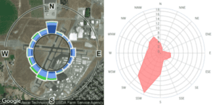
How to Read a Wind Rose
Despite drawing from the same data set, the difference in the shape of the wind roses above highlights a key distinction in what the visual representations of the data can suggest. From the wind rose on the left, one might incorrectly assume that the winds from the north would be a large concern because the north direction has one of the largest segments on the rose. However; once we consider that the dark blue band represents wind speeds of 0-1 miles per hour, we quickly realize the relative insignificance of this north segment. In this way, the wind rose on the right is less open to misinterpretation because lower wind speeds coincide with smaller quantities of wind movement.
In the end, both representations can provide WeatherSolve engineers with valuable insight. Wind run is useful for helping to identify wind directions of concern, particularly in situations where the client has not provided any meteorological data or anecdotal observations. Wind speed is most useful when the client has identified specific thresholds above which wind gusts become problematic. This is often the case when dealing with sophisticated scientific instruments (such as telescopes) that cannot collect reliable data when wind gusts exceed a particular velocity. In these situations, WeatherSolve engineers would be interested in the wind directions where the higher velocity wind speed bands are present.
Written by Taylor Gallivan